Energy & transport•Updated weekly
Fuel Prices in Kenya: Latest Hike & Impact
Readable simulation snapshots on pump price shifts, household impact, and downstream economic pressure.
A public-facing website for publishing visual simulation work on fuel prices, EV charging, transport operations, and project delivery with a strong editorial presentation.
Publishing rhythm
Weekly
Fresh analysis every cycle
Core coverage
4 themes
Energy, mobility, housing, operations
Format
Visual-first
Infographics, maps, briefs, snapshots
This week’s lead
Fuel, transport, and consumer impact reporting
Built for
Consistent weekly publishing and shareable visual briefs
Each weekly post can live as a featured visual card, making the site easy to update while keeping your best simulation work front and center.
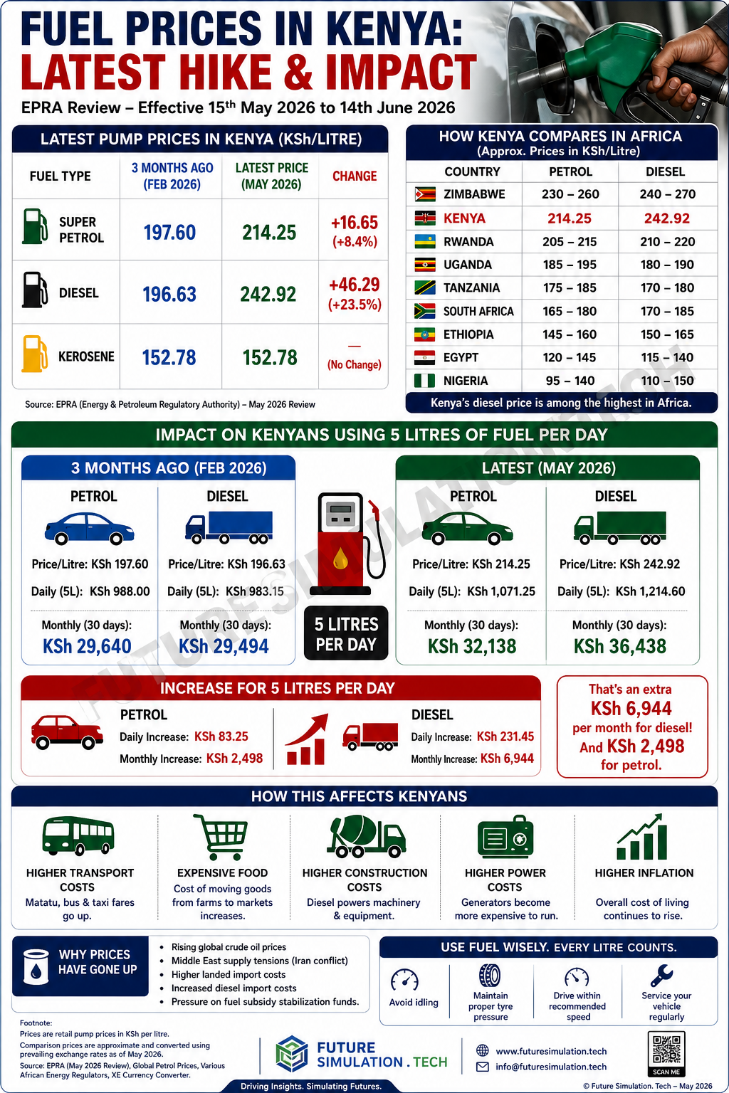
Readable simulation snapshots on pump price shifts, household impact, and downstream economic pressure.
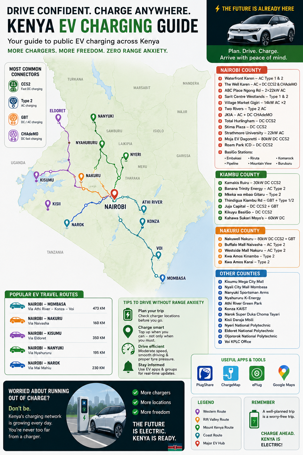
Coverage of public EV corridors, county charging locations, route distance planning, and charging confidence.
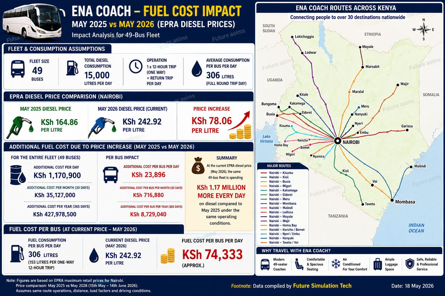
Fleet-level modeling for route cost changes, diesel assumptions, per-bus exposure, and decision-ready summaries.
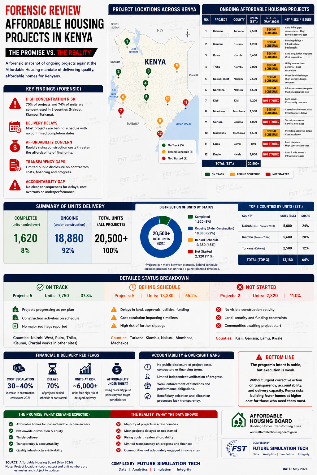
Project delivery tracking, county comparisons, risk signals, and concise forensic summaries for public discussion.
A dedicated track for political teams: strategy frameworks, polling station control sheets, GPS movement plans, and presidential scenario heatmaps — all built in the same weekly visual style.
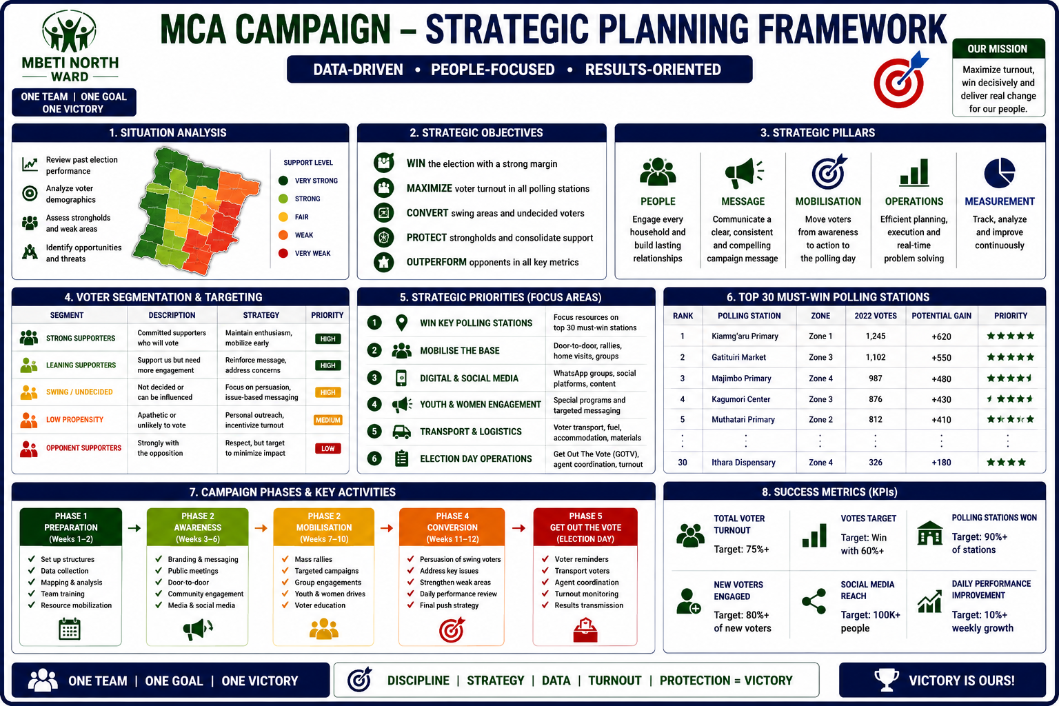
Situation analysis, strategic pillars, voter segmentation, must-win polling stations, phases, and KPI targets for a disciplined ward campaign.
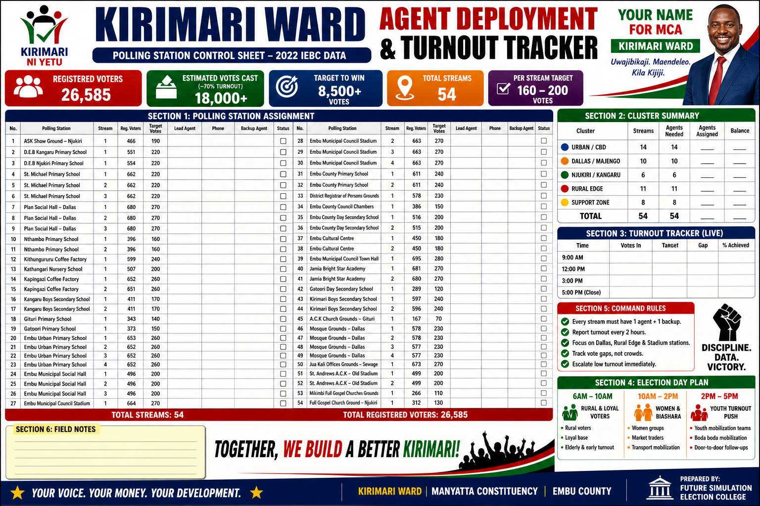
Polling station assignments, cluster summaries, live turnout tracking and command rules for full-coverage election day operations.
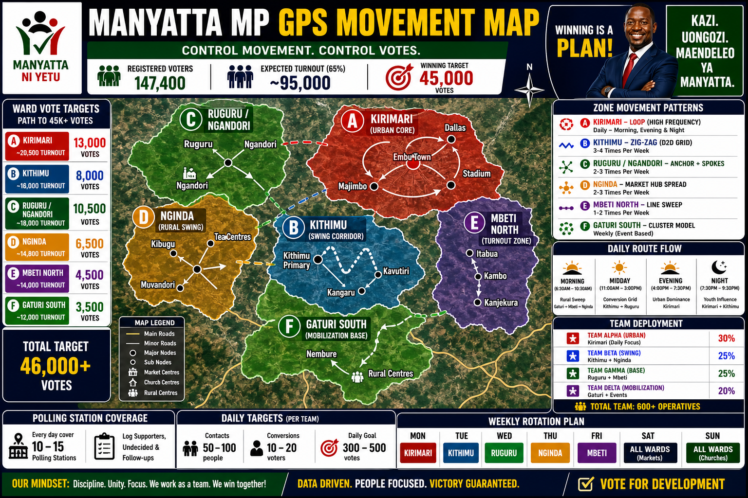
Ward-by-ward vote targets, zone movement patterns, team deployment splits, and a weekly rotation plan to control movement and votes.
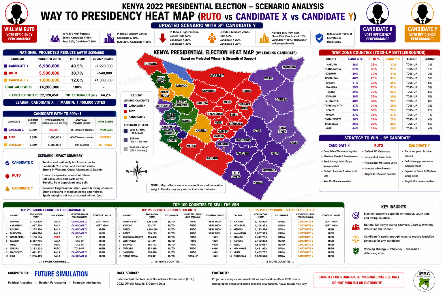
Projected national results, county heatmap, war-zone toss-ups, path to 50%+1 and candidate-specific strategies under a third-candidate scenario.
Track EPRA-linked price changes, sector impact, and consumer exposure with concise simulation summaries.
Show route viability, EV charging confidence, fleet economics, and road-network opportunities in Kenya.
Pair maps with location-based reporting so every weekly update stays grounded in real places and routes.
Translate complex project delivery data into readable findings, risks, and executive-style summaries.
Replace the top featured image, refresh the supporting cards, and keep a stable layout that readers learn quickly. This gives you a consistent publishing rhythm without redesigning each week.
Bring in pricing changes, route shifts, project status signals, or other new simulation inputs.
Turn the newest data into before-and-after views, scenario snapshots, and map-led explanations.
Release a polished visual brief that is easy to scan on mobile, desktop, and social sharing previews.